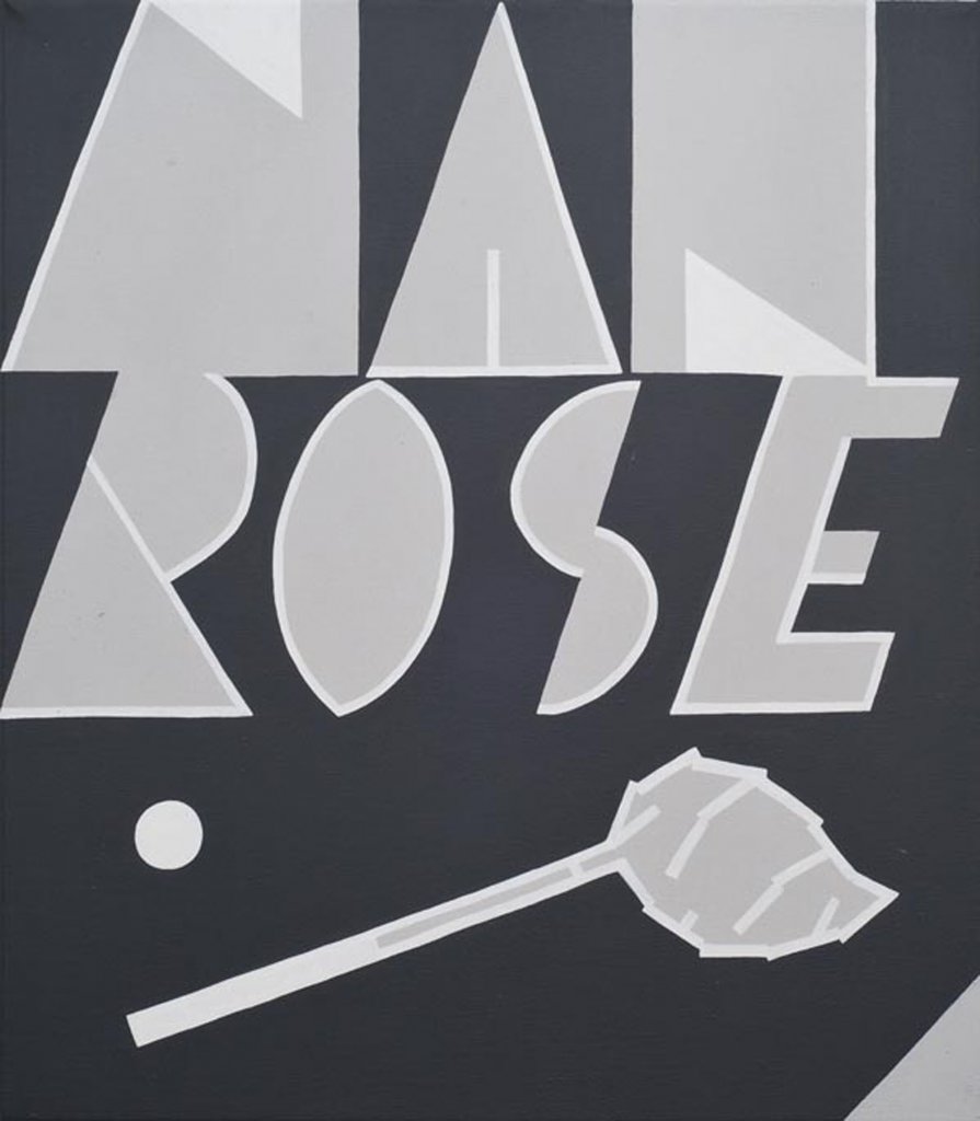
Mitch Cairns | Man Rose
20 August – 18 September 2010
»
«
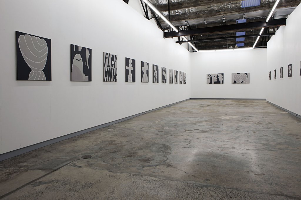
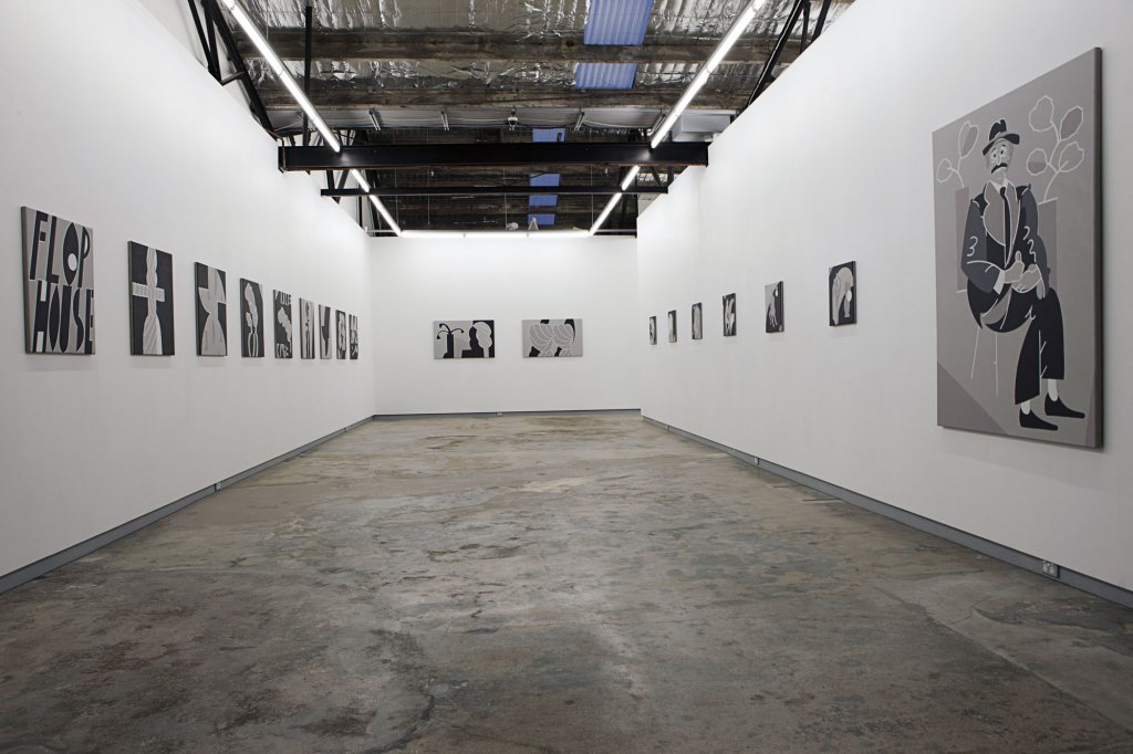
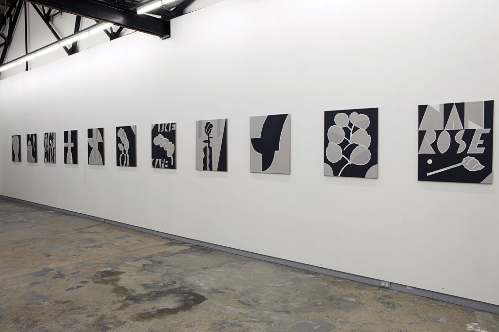
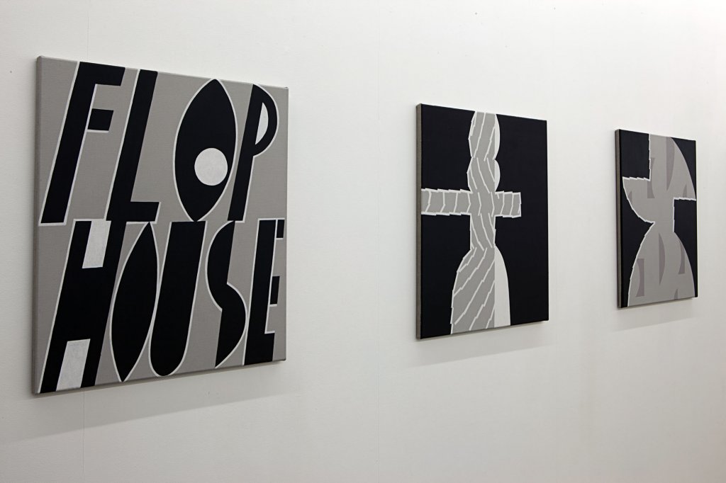
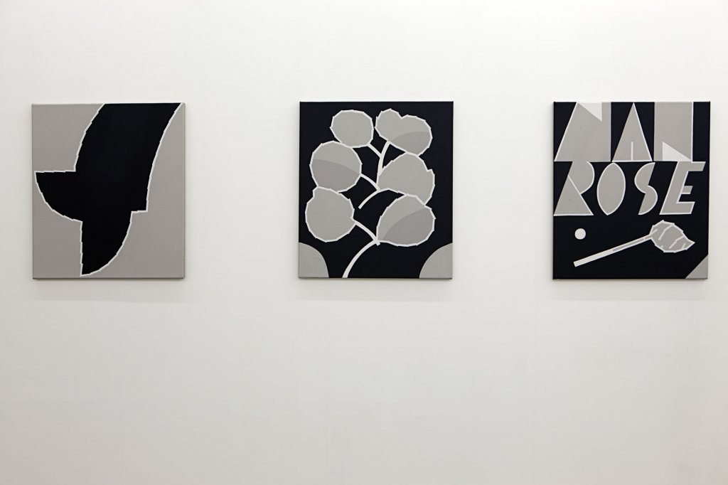
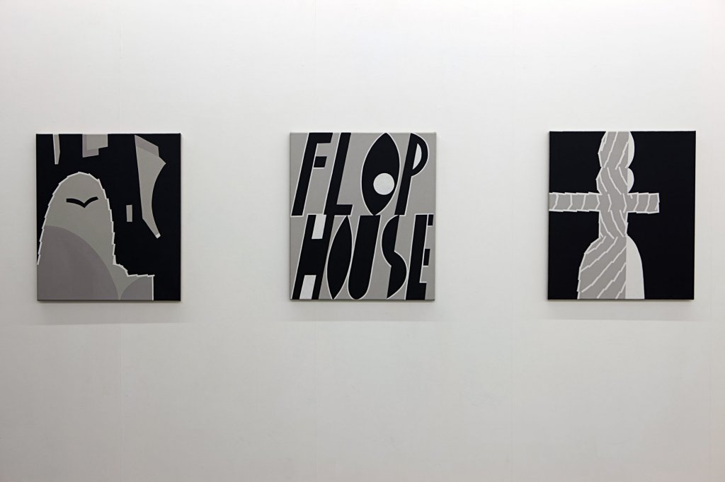
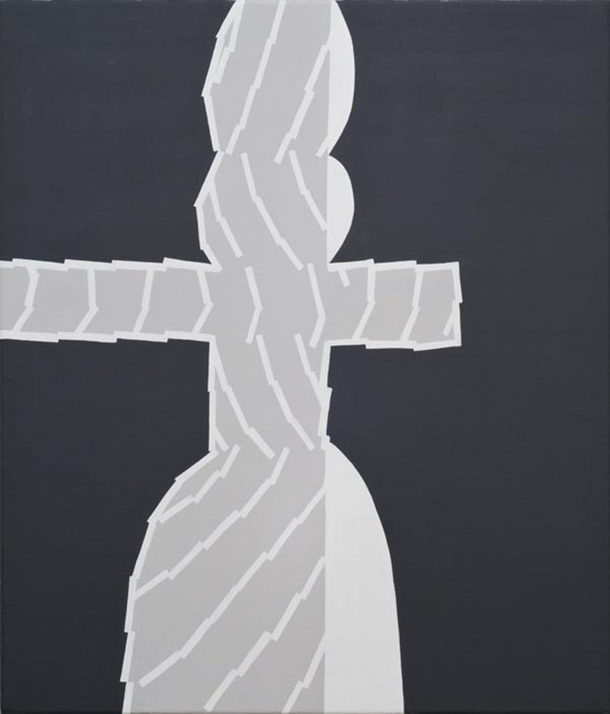
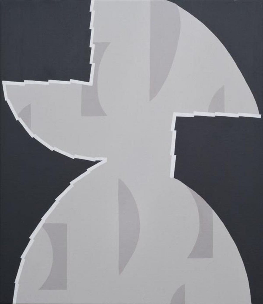
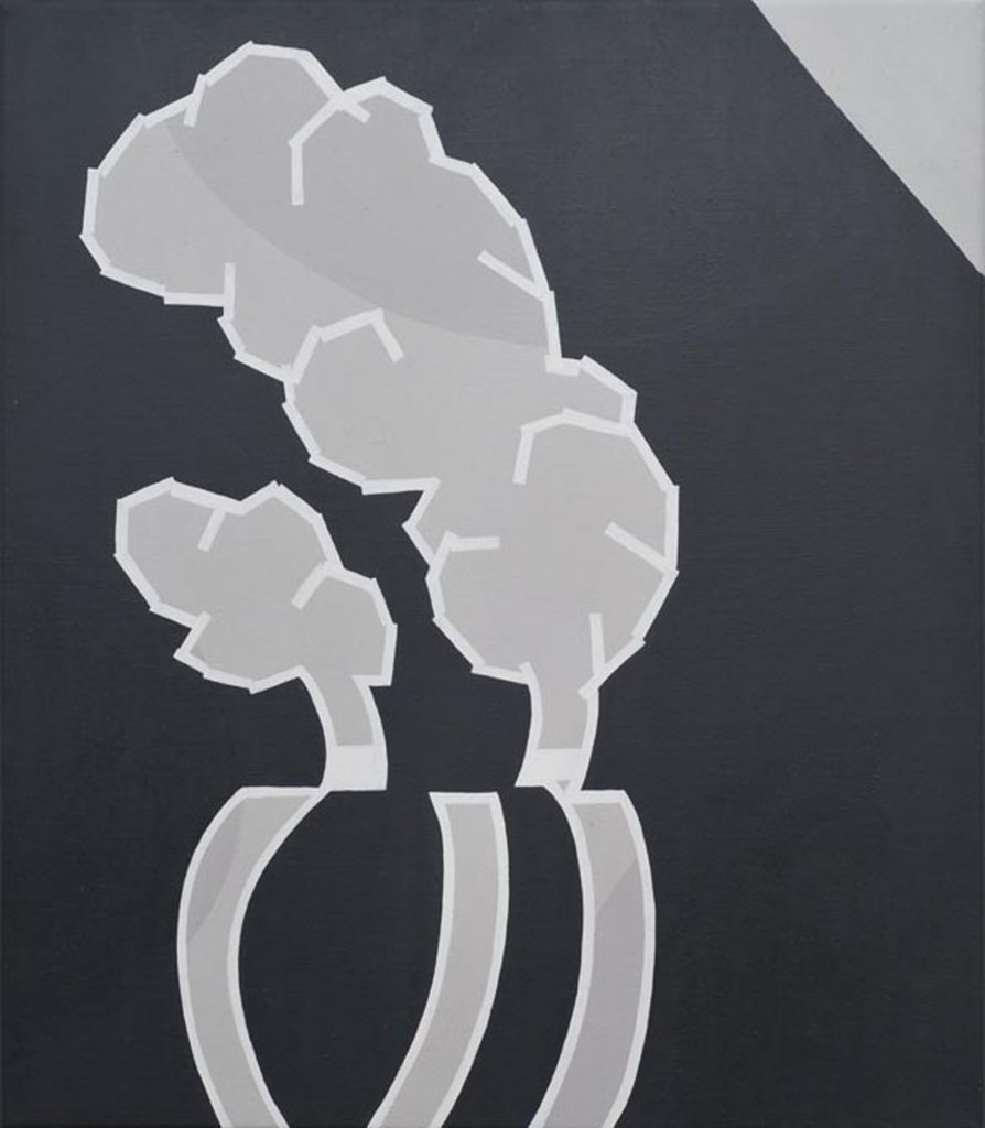
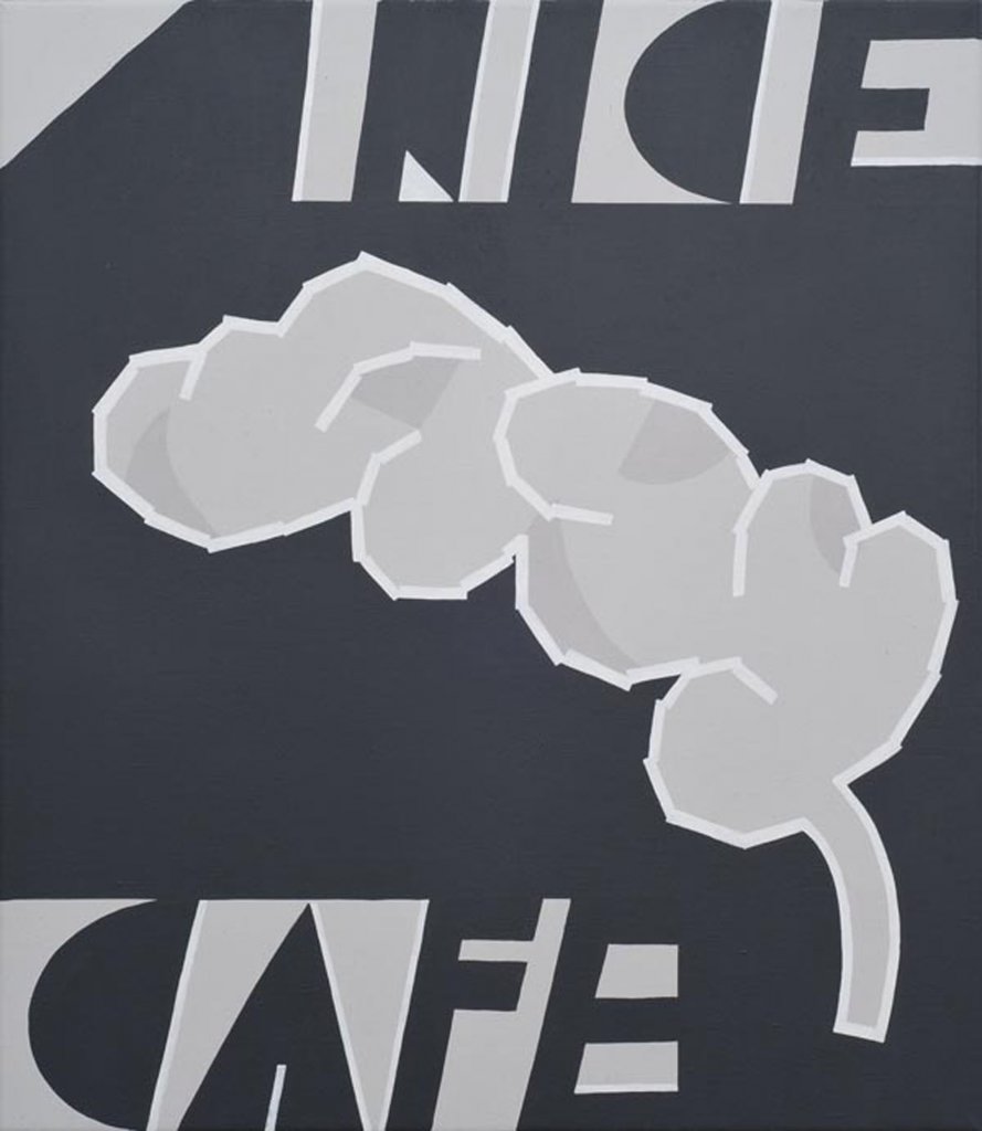
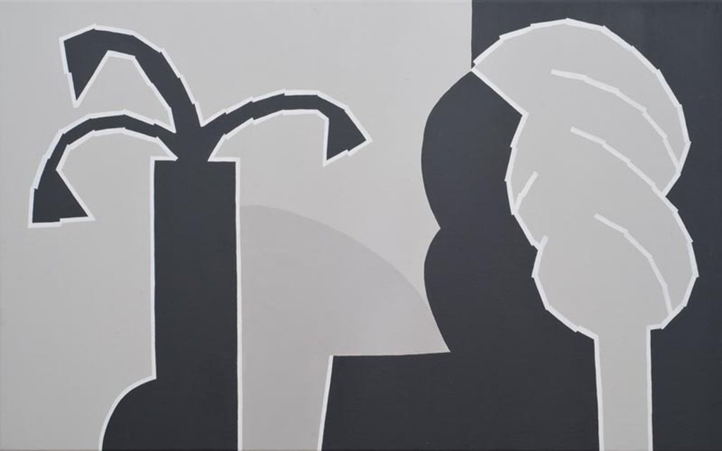
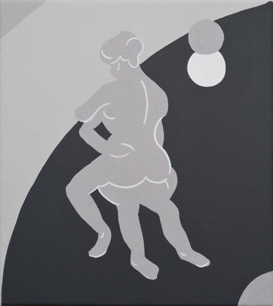
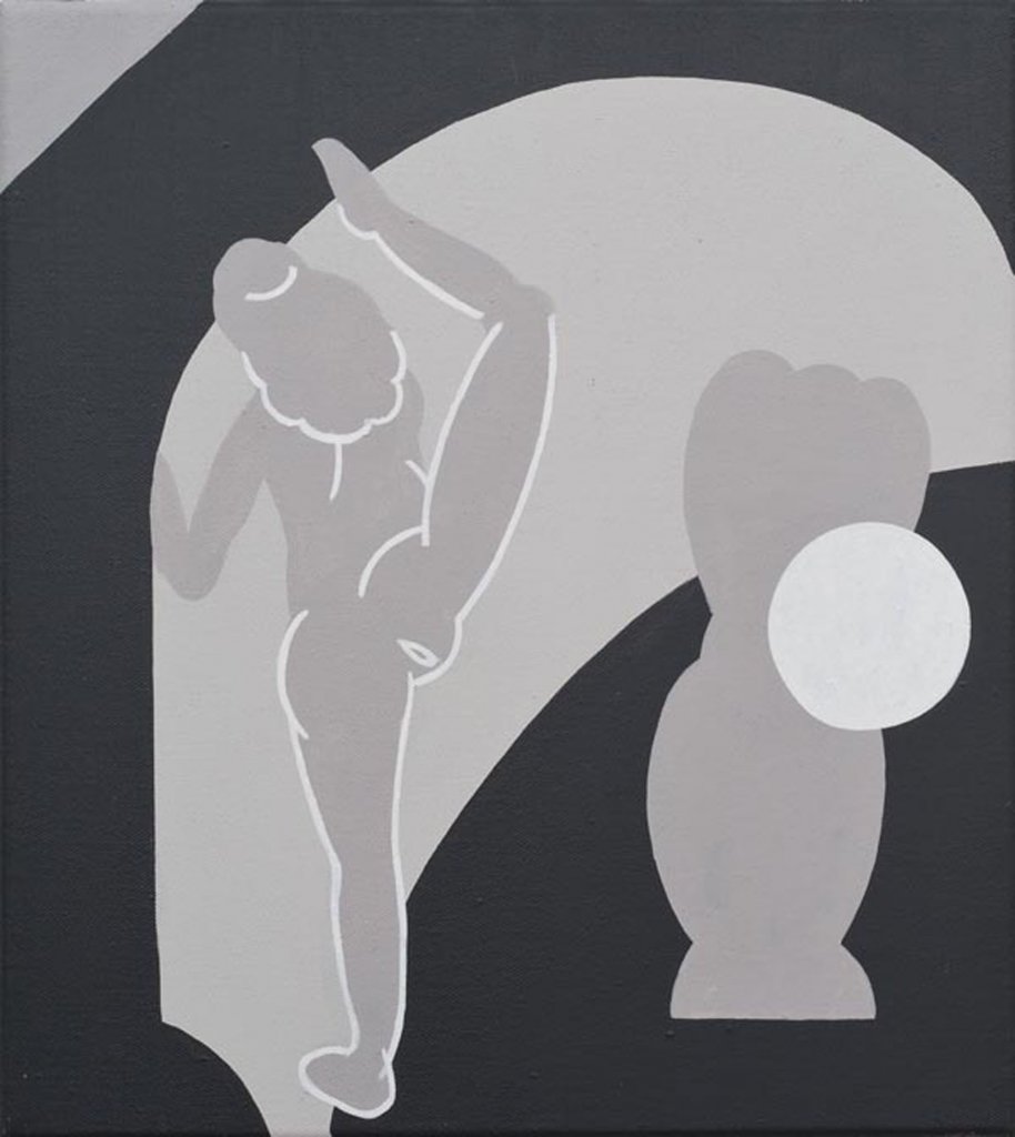
Mitch Cairns | Man Rose (installation view) 2010
Mitch Cairns | Man Rose (installation view) 2010
Mitch Cairns | Man Rose (installation view) 2010
Mitch Cairns | Man Rose (installation view) 2010
Mitch Cairns | Man Rose (installation view) 2010
Mitch Cairns | Man Rose (installation view) 2010
Mitch Cairns | Man Rose (installation view) 2010
Mitch Cairns | Man Rose (installation view) 2010
Mitch Cairns | Man Rose (installation view) 2010
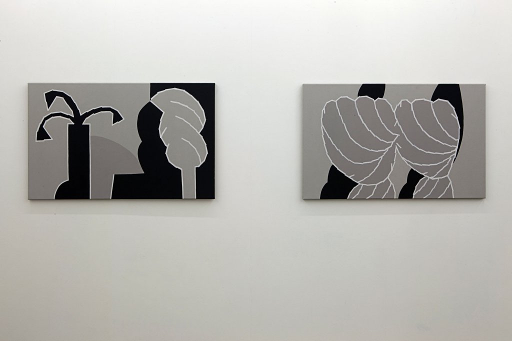
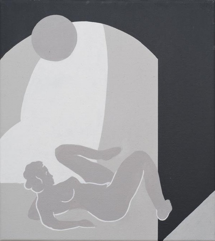
Mitch Cairns Easy Living / Rhythm Method (Rose) 2010 acrylic, wax varnish on linen 77 x 124 cm each
Mitch Cairns Easy Living / Rhythm Method (Painted From Stock) 2010 acrylic, wax varnish on linen 77 x 124 cm each
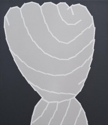
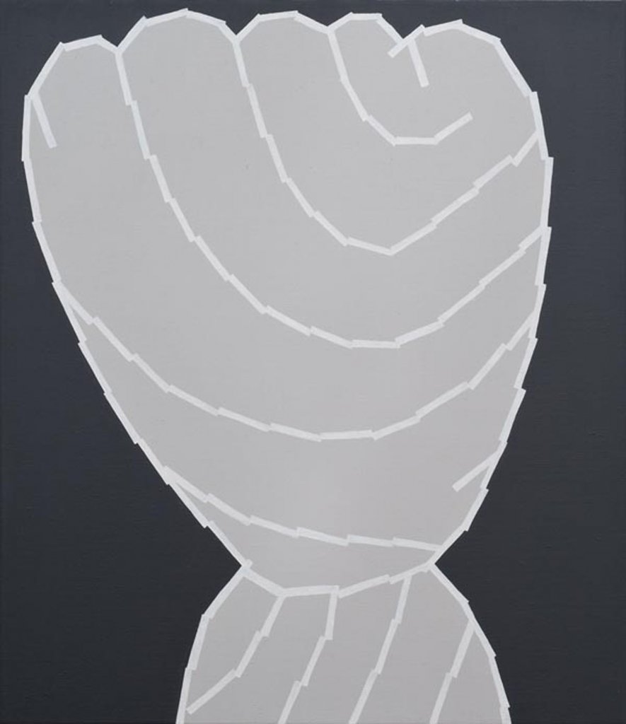
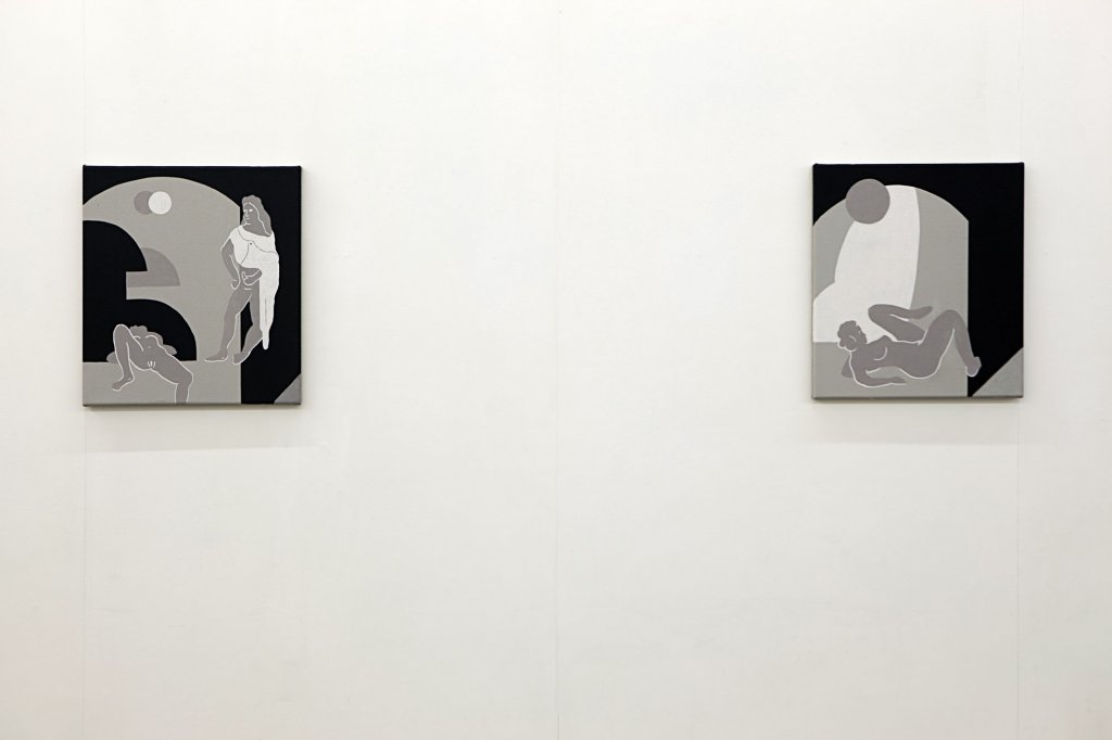
Mitch Cairns Easy Living / Rhythm Method (Fist Fight) 2010 acrylic, wax varnish on linen 77 x 67 cm
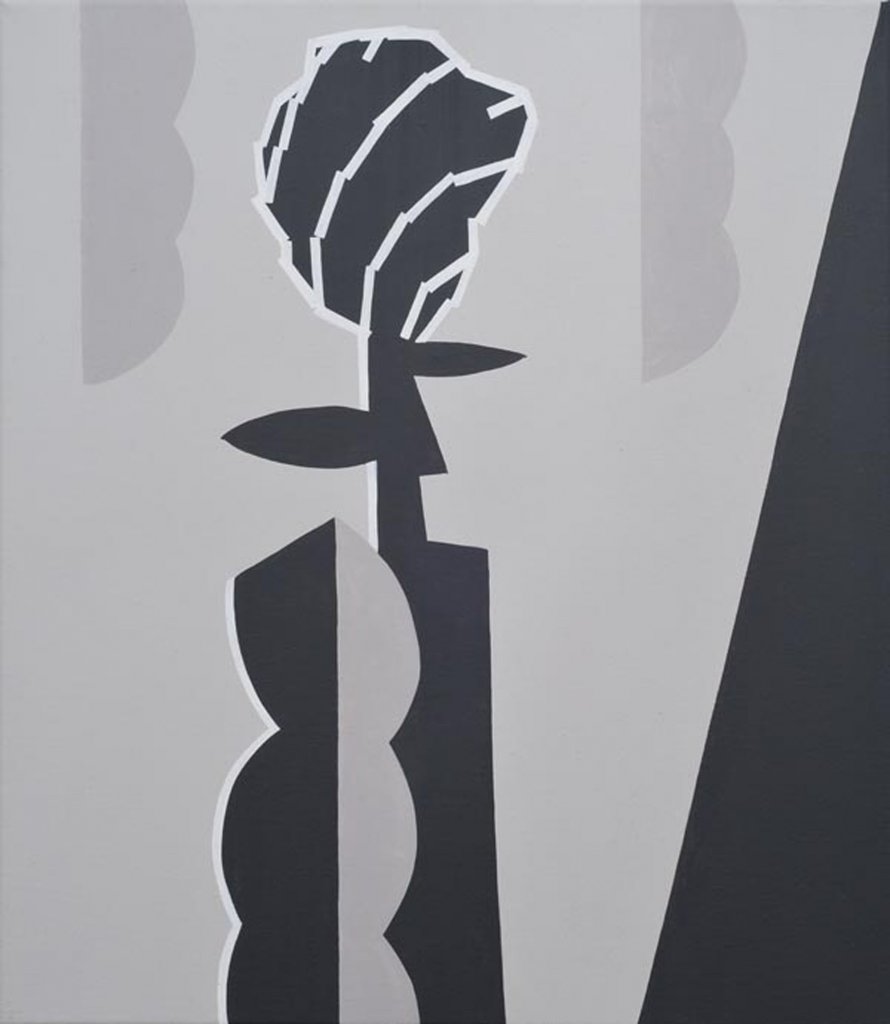
Mitch Cairns Easy Living / Rhythm Method (Man Rose) 2010 acrylic, wax varnish on linen 77 x 67 cm
Mitch Cairns Easy Living / Rhythm Method (Nude) 2010 acrylic, wax varnish on linen 77 x 124 cm each
Mitch Cairns Easy Living / Rhythm Method (Muse) 2010 acrylic, wax varnish on linen 77 x 67 cm
Mitch Cairns Easy Living / Rhythm Method (Rest Room) 2010 acrylic, wax varnish on linen 77 x 67 cm
Mitch Cairns Easy Living / Rhythm Method (Old Time) 2010 acrylic, wax varnish on linen 77 x 124 cm each
Mitch Cairns Easy Living / Rhythm Method (The Total Hotel Experience) 2010 acrylic, wax varnish on linen 77 x 67 cm
Mitch Cairns Easy Living / Rhythm Method (Slow Time) 2010 acrylic, wax varnish on linen 77 x 124 cm each
Mitch Cairns Easy Living / Rhythm Method (Traditional) 2010 acrylic, wax varnish on linen 77 x 124 cm each
Mitch Cairns Easy Living / Rhythm Method (Working F.O.H.) 2010 acrylic, wax varnish on linen 77 x 124 cm each
Mitch Cairns Easy Living / Rhythm Method (Two Roses) 2010 acrylic, wax varnish on linen 77 x 124 cm each
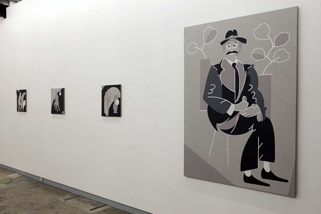
Mitch Cairns Easy Living / Rhythm Method (Cabinet Painting #2) 2010 acrylic, wax varnish on linen 46 x 41 cm
Mitch Cairns Easy Living / Rhythm Method (Cabinet Painting #3) 2010 acrylic, wax varnish on linen 46 x 41 cm
Mitch Cairns Easy Living / Rhythm Method (Cabinet Painting #4) 2010 acrylic, wax varnish on linen 46 x 41 cm
Mitch Cairns Easy Living / Rhythm Method (Cabinet Painting #6) 2010 acrylic, wax varnish on linen 46 x 41 cm
Mitch Cairns Easy Living / Rhythm Method (Cabinet Painting #5) 2010 acrylic, wax varnish on linen 46 x 41 cm
Mitch Cairns Easy Living / Rhythm Method (Cabinet Painting #1) 2010 acrylic, wax varnish on linen 46 x 41 cm
MITCH CAIRNS IN CONVERSATION
with Agatha Gothe-Snape and Shane Haseman
14 August 2010
Why Man Rose?
This show was produced in my home studio. This space became very important to me. I became quite domestic in this time. One week, I was replenishing a vase of flowers, and the flower of choice was kale. The kale was described to me by the florist as being "a man’s rose”. This seemed like a good name for the show.
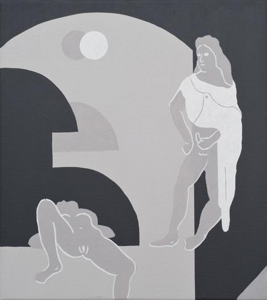
Do you mean because there’s a kind of eroticism about this term "man rose”. It alludes to genitalia. This seems to fit in with some of the erotic content of the show, which is suggested by the titling, dealt with in the subject matter and also obvious in your reference to French cabinet painting. Can you talk a bit about this?
On a simple level the title can be read as "man/woman” and I suppose from that reading there is instantaneously a sexual tension or sexual allusion. The title of the show came after I had completed two distinct suites of painting. One was highly abstracted, but no less suggestive of sex and of the desire to use sex as the content for the show; the other explored the more graphic, legible, highly erotic and perhaps slightly perverted genre of cabinet paintings.
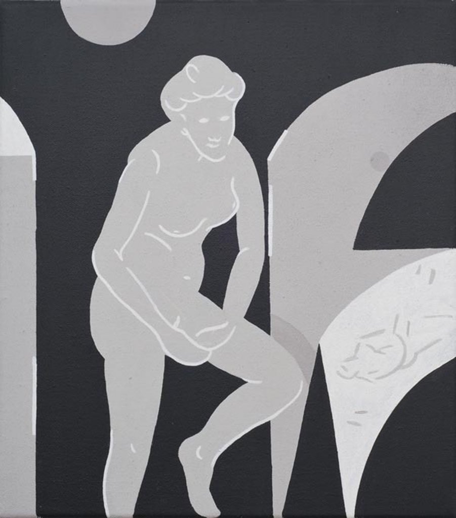
Speaking of the cabinet paintings, what kind of source material do they draw on? Pornographic material, sex education/instructional material? I’m just thinking about Picabia’s pornographic paintings of the 1940’s?
The cabinet paintings directly draw on my interest in both the work and life of Richard and Pat Larter. Picabia has always been a big influence on my practice – Picabia’s for all seasons!
But unlike the aforementioned artists, your depiction of the sexual act, and the works general eroticism is explored through a much more restrained and even banal aesthetic. It’s not as lavish, baroque or in any way as kitsch as the pornographic works of Picabia, or even Larter. In fact, it almost has a kind of aesthetic indifference…
That’s true. But the banal or even home-style depictions of sex as depicted by Larter were an honest point of attraction. Richard and Pat Larter present sex as a domestic act. Sure my works aren’t as colourful or decorative as Larter’s, but there is a similar sentiment to do with domesticity and sexuality.
Are these erotic paintings meant to also be funny? There is a cartoonish and even slapstick element to the works?
I think the graphic and or illustrative quality of the works allow them an innocence and stop short of them becoming an overtly perverted display of my attraction to the subject. But in short, sex is inherently funny and at times clumsy, and this is what slapstick generally draws on. But these paintings also come from the reverence I have for sex and the figure.
I’d like to talk about the cabinet. It is a place of privacy – a site that is hidden from the public or shared with a select few. What relationship do you think this type of definition of cabinet paintings has to do with contemporary art?
Sexuality in general is rarely aired in my milieu of contemporary painting. The private nature of cabinet paintings speaks to this invisibility. Of course sex is no longer taboo, yet it’s interesting that sex has so little currency in certain aspects of contemporary painting. So I guess the use of the word cabinet alludes to this sense that sexuality is still something that is hidden and private in discourses surrounding contemporary painting. But this is by no means my soul motivation for making these figurative works.
Speaking of the figure there seems to be a tension here. On the one hand, some works are dealing with the monochrome and aspects of non-objective painting, which historically erased the figure. On the other hand the figure haunts these monochromes. Its’ confusing?
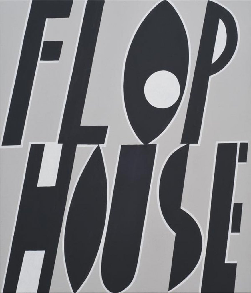
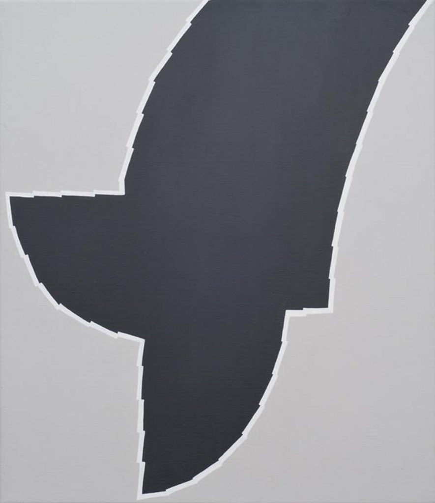
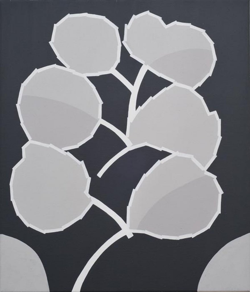
In these paintings there was a level of trying to unpack the monochrome by making additions to it – what I refer to as "correcting the monochrome”. I add suggestive shapes, abstracted shapes, actual figures and sexy figures. The monochrome for me is an entirely confronting "image”. Ultimately I am an image-maker and ironically the monochrome is one of many "images" from which I can draw upon.
But also, ultimately, I enjoy a point of inclusion, for my audience and myself. I think whacking a figure into the monochromes lends a sense of accessibility to the painting. If my folks get into this shared space between the monochrome and figurative painting there is a sense of victory.
Speaking of these formal concerns, where does the jagged white line that sits between the figure and ground in most of the paintings come from and what pictorial role does it play?
I found it to be a simple device that allows the figure to not simply float on the ground. The jagged line irritates the eye and points explicitly to this tension I am working with between the figure and the ground. I think it’s making a joke of this whole conundrum – it’s a parody of types. It’s also a self-reflexive joke because I’m always struggling with this relationship. Its an over simplified gesture which at some level makes light of this perceived difficulty that was a major formal concern at the NAS [National Art School]. I’ve lovingly adopted this pictorial conundrum as a point of play.
This is the third body of work in which you have been dealing with a tonal exercise. Why no colour?
I made a decision some years back as an exercise to work exclusively with tone as a means of developing one aspect of my visual education. Colour is complicated and reducing my painterly practice to tonal problems is useful. It's reductive – I can see a series of problems. It’s also the triumph of limitation – to focus on one thing and by doing so creating a series of further problems.


 |
Privacy |
Disclaimer
|
Privacy |
Disclaimer


